Color is what gives a room personality. It can make a space feel calm, warm, bright, or dramatic.
Once the layout and structure are in place, color is what starts to bring the room to life.
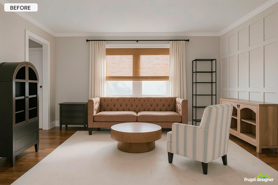
Designers think about color as a palette — how different tones work together across a room.
What this means for you is choosing a few colors and repeating them so the space feels connected, while also adding contrast so it doesn’t feel flat.
Below is the color story for this room. We love the combination of the blues and cramel tones, with black acting as an anchor to ground the space:
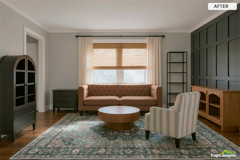
We added a darker wall behind the low cabinet to create contrast with the rest of the room. That shift from light to dark gives the space more depth. The tall dark charcoal cabinet on the opposite site of the room creates balance.
Looking at the room, your eye is naturally drawn to that wall first, which helps anchor the space.
We brought in an area rug that picks up tones from the wall color and furniture, and spreads them across the floor. That’s what helps carry the color through the room instead of it staying in just one spot.
Looking at the space, your eye moves from the wall down into the rug, which helps everything feel connected.
