Pattern is what adds detail and personality to a room. It’s where the space starts to feel more styled and less basic.
At this point, the room already has layout, structure, color, and texture. Pattern is what brings everything together and adds visual interest.
Designers think about pattern as repetition — shapes, lines, or designs that show up more than once in a space.
What this means for you is adding a few patterns and repeating them so the room feels more interesting, without making it feel busy.
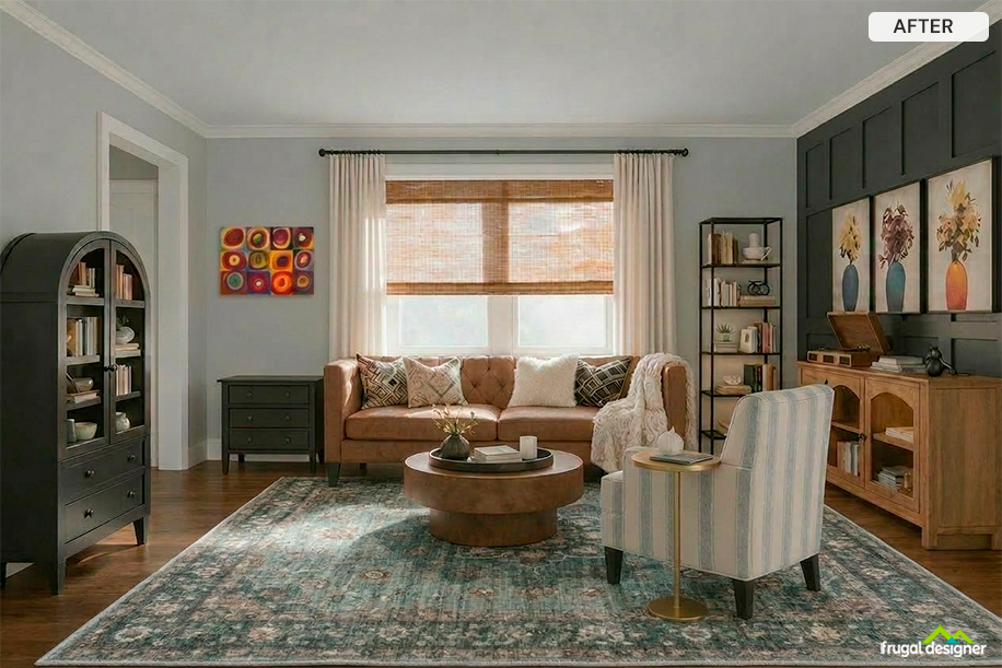
We added an abstract art piece that stands out from the rest of the patterns in the room. It contrasts with the more structured vase prints, but in a way that still works together.
The abstract piece also pulls slightly away from the main color palette, which adds interest and keeps the room from feeling too matched or formulaic.
Looking at the space, your eye is drawn to that piece first, which adds energy without overwhelming the room.
This piece adds contrast and keeps the room from feeling too uniform:
We repeated patterns across the room so your eye naturally moves from one area to another. The three vase prints create a clear repetition, while the patterned pillows carry that detail across the seating area.
We also added books to the shelving and cabinet, which repeat similar shapes and spacing. That subtle repetition helps connect those pieces instead of making them feel separate.
You can see this in the vertical elements too — the striped armchair, the curtains, and the wall paneling all echo each other.
Looking at the space, your eye moves from the artwork to the seating and across the room, picking up those patterns along the way instead of jumping around.
These are the art pieces we added: